
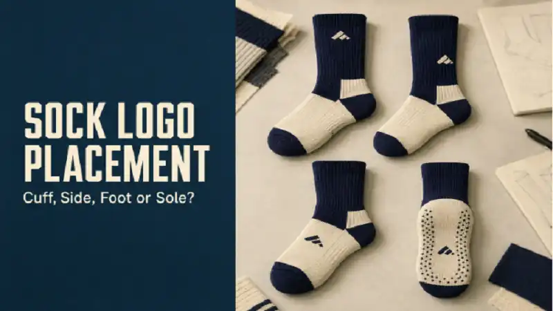
Sock logo placement seems simple until the buyer sees how different placements behave when worn. A logo on the cuff is visible in one way. A side logo works differently. A foot logo may look good when flat but disappear inside shoes. A sole logo may be useful only in certain settings.
Choosing the right placement depends on the sock height, shoe type, and branding goal.
Cuff Logos Are Easy to Understand
A cuff logo is one of the most common choices because it is simple and visible on crew socks and taller styles. It works well for initials, small icons, and short names.
For buyers planning custom socks with logo, cuff placement is often a safe starting point because it does not require a large design.
The logo still needs to stay small enough to avoid stretching badly.
Side Logos Feel More Athletic
Side placement can work well for sports socks, gym socks, and team socks. It gives the design a more active look and can pair well with stripes or color blocks.
The risk is distortion. If the logo is too wide or placed across a high-stretch area, it may not look as clean when worn.
Foot Logos Are Less Visible
A logo on the top of the foot may look clean in packaging photos, but it can be partly hidden by shoes. This can still work for subtle branding, but it is not ideal when visibility is the main goal.
If the order is for giveaways or team identity, a cuff or side logo is usually more effective.
Sole Graphics Need a Reason
Sole graphics can be useful for grip socks, studio socks, or novelty designs. But for normal socks, they are less visible during daily use.
If grip is involved, the sole area should prioritize function first. Branding should not interfere with anti-slip placement.
A guide to types of socks can help buyers match sock height with logo placement before final approval.
Final Thought
Sock logo placement should follow how the sock will be worn. The best placement is not always the most creative one. It is the one that keeps the logo readable and useful in real use. See more